RC Blocks
As we've seen in previous topics, RadCORE uses the concept of BLOCKS (like DIVs) to help us create our project's responsiveness in a 12-column "virtual" system (bootstrap style).
Using RC ELEMENTS we will add a sequence of 3 blocks to the form (we will use RadCORE STARTER):
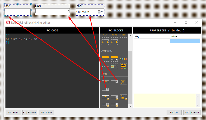
Each of the blocks is defined as:
[[
cols:xs-12 sm-12 md-12
]]
That is, each one occupies 12 columns in any screen size. This is an ideal setting for MOBILE but not for a medium / large screen.
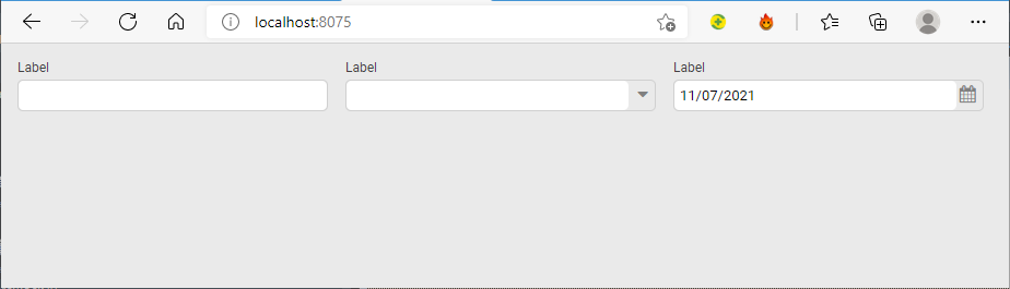
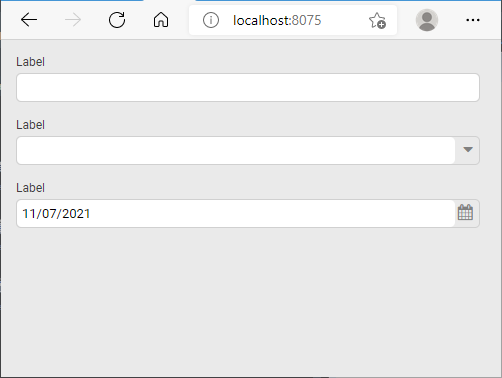
Let's adjust the values to:
[[
cols:xs-12 sm-12 md-4
]]
We have 3 blocks where the attribute "md-" will have 4 columns, so 4 x 3 = 12. This means that in a medium to large resolution the 3 blocks must occupy a single row but,
at minus resolutions ( xs- and sm- ) they will occupy individual rows.
Let's look at the screen rendered in both patterns to better understand:
> As described in previous topics look at components within blocks to understand how they expand and contract.
As a practical exercise, apply responsiveness to the HOLIDAYS form we created earlier.
READ ! Practice!
RadCORE's responsiveness is very easy to apply but it's necessary to test its possibilities for you to fix the idea.
The Example "frmRCBLOCKS", "frmDEMO_FORMS", "frmCadCLIENTES" contains practical examples of several ways to apply responsive blocks, it is very important to study each one of them.
Created with the Personal Edition of HelpNDoc: Full-featured multi-format Help generator