Rendering Analysis
REMEMBER
All attributes/functions that will be analyzed will be in the initial topics of this documentation or in the source code for studies.
IMPORTANT
Based on the detailed analysis that we will see, you will be able to analyze all RadCORE demos to better understand and learn the most diverse resources available and, therefore, know how to apply them correctly to your applications.
EVENTS
RadCORE uses several functions/procedures to render/activate/process its resources, so all DEMOS will contain some type of call. Always check these events and study them.
Let's look at the features of the example: frmDashBoardEcommerceThemed
OnCreate
In this event you will see functions for applying layout to some captions (we'll talk more below) and the default Layout rendering function.
OnReady
Responsive blocks default rendering function and call to "rc_UpdateCharts" to render the example graphic chart of the "htmlSales and htmlOthers" components.
The first block on the dashboard is "rcBlock10".
It is made up of several other blocks and components:
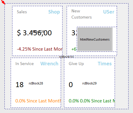
Your rendering looks like this:
Let's analyze and understand the attributes of each of the blocks.
The "rcBlock10" block contains the following attributes:

01. "cols:" in this example, will render the block with a width of 12 columns for small screens or medium screens up to the resolution limit for "lg-" which, in this case, will render the block with a width of 6 columns.
This setting is useful for compatibility with tablet screens.
02. "round:all" will apply rounded corners to all edges of the block.
03. "noborder-all" will remove the lateral "off-set" from the block's edges, that is, the block will not have the standard spacing at the edges.
04. "hr-childs:" will automatically expand ( "-exp" ) the "height" of the "rcBlock10" block according to the total sum of the "height" of each of the blocks inside it.
05. "h-replicate:" will replicate the "height" defined by "hr-childs:" for the block "rcBlock40" except if the access is mobile and in a vertical position.
The blocks "rcBlock15, rcBlock20, rcBlock25, rcBlock30" contain the following attributes:
01. "cols:" in this example, will render the block with a width of 12 columns for small screens and 6 columns for other formats.
02. "cls:" will apply 2 css classes to round the corners and add a slight shading and the second class will apply a "hover" effect when hovering.
Let's analyze the objects contained in "rcBlock15"
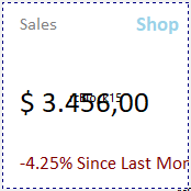

01. "labDashSales"
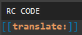
"translate:" will be used to control "RC TRANSLATE" for real-time translation of the "caption".
02. "labIcoSales"
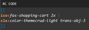
"ico:" will render a standard FontAweSome solid( "fas-" ) icon with 2x zoom.
"cls:" will apply 2 css classes so that the icon matches the current color theme and has a slight transparency.
03. "labSalesTotal"
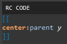
"center:" will center the label on its y-axis (vertically) based on the "height" of its parent component.
03. "labSales"
There are no attributes but in the OnCreate event:
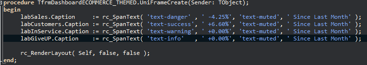
The "rc_SpanText" function is applied to render the effect seen above, where the percentage is displayed with a "text-danger" css and the rest of the text with "text-muted" css.
O segundo bloco do dashboard é o "rcBlock40".
Ele é composto de outros blocos e componentes:
01. "rcBlock40"

"cols:" in this example, will render the block with a width of 12 columns for small screens or medium screens up to the resolution limit for "lg-" which, in this case, will render the block with a width of 6 columns.
This setting is useful for compatibility with tablet screens.
"noborder-all" will remove the lateral "off-set" from the block's edges, that is, the block will not have the default spacing at the edges.
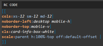
02. "rcBlock50"
"cols:" in this example, will render the block with a width of 12 columns for all screens.
"noborder-left:" will remove the offset space from the left edge of the block only when accessed via "desktop" or horizontal mobile ("mobile-h")
"noborder-top:" will remove the offset space from the border at the top of the block only when accessed by vertical mobile ( "mobile-v" ).
"cls:" will apply the white "card" css.
"scale:" will expand the "height" of the block by 100% equivalent to the "height" of its parent, deducting the value of "top" plus the default "off-set" (see theme control).
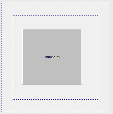
03. "htmlSales"

"anchor:" will anchor "htmlSales" to its parent's dimensions (it would be equivalent to "alClient" ).
The third block on the dashboard is "rcBlock60".
It is made up of other blocks and components:
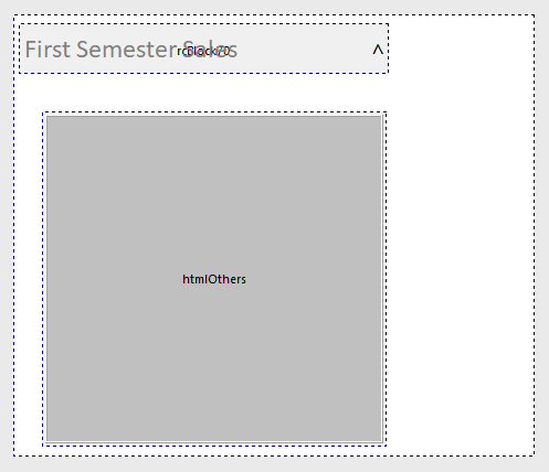
01. "rcBlock60"
"cols:" in this example, will render the block with a width of 12 columns for all screens.
"cls:" will apply the white "card" css.
"noborder-top" will remove the offset space from the top border
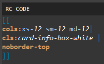
02. "rcBLock70"
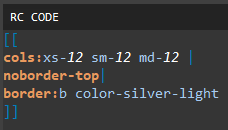
"cols:" in this example, will render the block with a width of 12 columns for all screens.
"noborder-top" will remove the offset space from the top border
"border:" will apply a border to the bottom ( "b" ) with a css of color "color-silver-light"
03. "labGraphTitle"
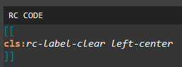
"cls:" will remove the RadCORE presets for labels( "rc-label-clear" ) and apply a center-left alignment.
04. "rcCollapse60"
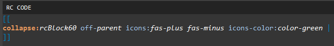
"collapse:" will create the "collapse" effect for the "rcBlock60" block by applying green fontawesome icons.
05. "rcBlock80"
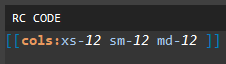
"cols:" in this example, will render the block with a width of 12 columns for all screens.
Created with the Personal Edition of HelpNDoc: Free iPhone documentation generator