rcBlocks: basic sample
As we've seen in previous topics, RadCORE uses the concept of BLOCKS (like DIVs) to help us create our project's responsiveness in a 12-column "virtual" system (bootstrap style).
Using RC ELEMENTS we will add a sequence of 3 blocks to the form (we will use RadCORE STARTER):
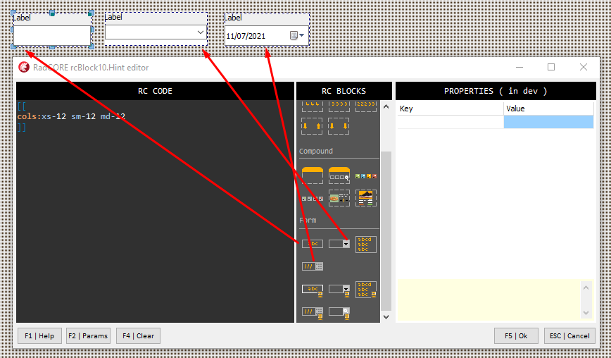
Each of the blocks is defined as:
[[
cols:xs-12 sm-12 md-12
]]
That is, each one occupies 12 columns in any screen size. This is an ideal setting for MOBILE but not for a medium / large screen.
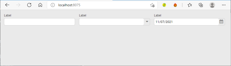
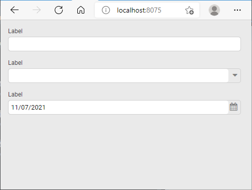
Let's adjust the values to:
[[
cols:xs-12 sm-12 md-4
]]
We have 3 blocks where the attribute "md-" will have 4 columns, so 4 x 3 = 12. This means that in a medium to large resolution the 3 blocks must occupy a single row but,
at minus resolutions ( xs- and sm- ) they will occupy individual rows.
Let's look at the screen rendered in both patterns to better understand:
> As described in previous topics look at components within blocks to understand how they expand and contract.
As a practical exercise, apply responsiveness to the HOLIDAYS form we created earlier.
READ ! Practice!
RadCORE's responsiveness is very easy to apply but it's necessary to test its possibilities for you to fix the idea.
The Example "frmRCBLOCKS", "frmDEMO_FORMS", "frmCadCLIENTES" contains practical examples of several ways to apply responsive blocks, it is very important to study each one of them.
Review the "FIRST STEPS" topic and study carefully to then practice more complex features.
Created with the Personal Edition of HelpNDoc: Full-featured multi-format Help generator