Applying Responiveness
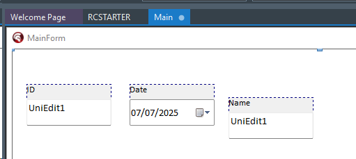
Following our small application previously, let's select each "pair" of components: a Label and an "Edit" component.
Open the context menu by right-clicking on one of the selected components.
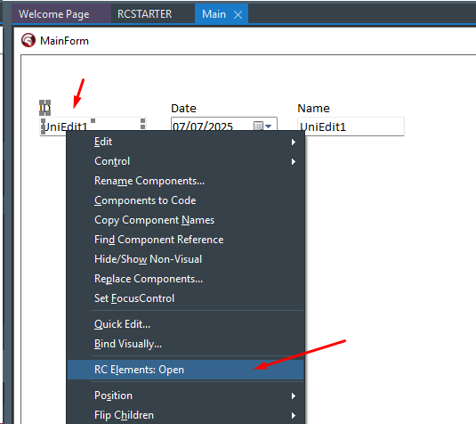
Then the RC ELEMENTs will be displayed:
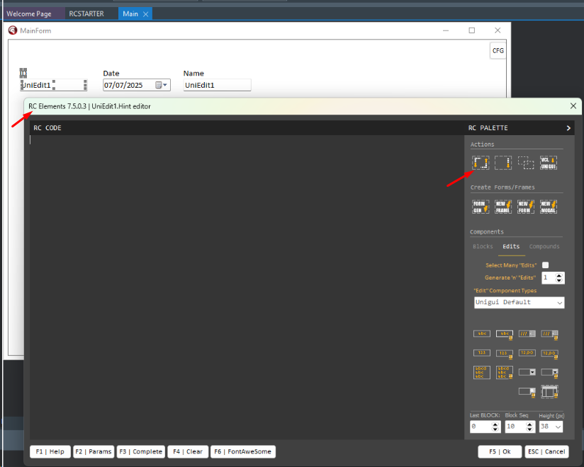
Now you must click on the Blockfy "Action", as indicated above and the Blockfy properties box will be displayed:
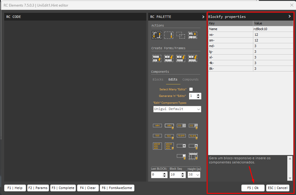
Blockfy will create a "responsive block" and transfer the selected components into it and apply our first responsiveness configuration.
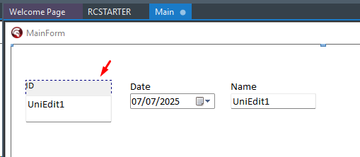
Repeat this same operation with the other 2 sets of components and then your form should look like this:
Each responsive block is simply a UniContainerPanel, native to UNIGUI, but with a configuration that will be interpreted by RadCORE at runtime.
Right-click only the "rcBlock10" component and activate RC ELEMENTs.
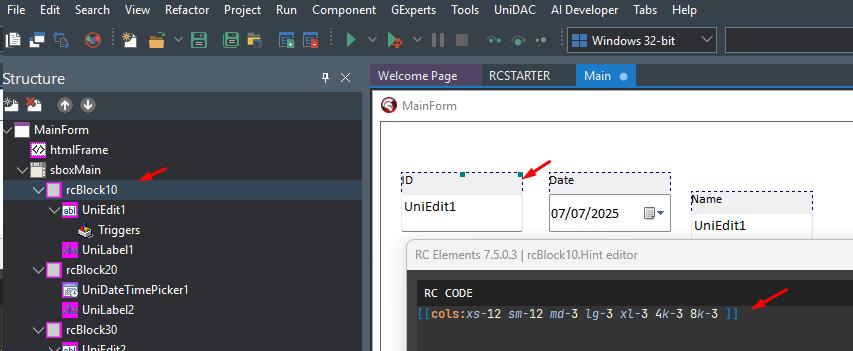
As we saw in a brief introduction in the topic: "Responsiveness: The Basics," you'll notice that BLOCKFY inserted a "cols:" instruction into each of our responsive blocks.
Remembering the 12-column virtual column pattern, we have:

Each block will occupy 12 columns on small screens (xs-12 and sm-12), and on medium screens and above, it will occupy 3 columns (md-3...).
Run the application and see the result:
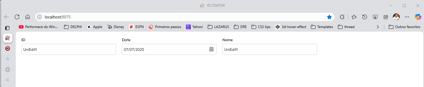
Notice that even with the components out of alignment, they all remain perfectly aligned and occupy the same "slice" of the screen.
Each one occupies 3 virtual columns, totaling 9 columns, leaving 3 columns remaining to complete a row.
You can adjust the browser window size and observe what happens.
Now, launch the browser's MOBILE simulator (in EDGE, it's F12).
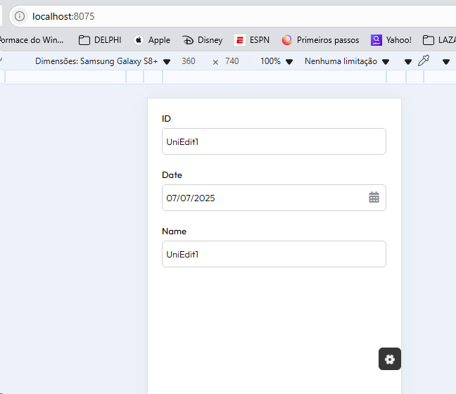
And so each block now occupies 12 columns, and each one "falls" below the other.
WHAT COMES NEXT
Now is the time to study and delve deeper.
Created with the Personal Edition of HelpNDoc: Easily create PDF Help documents