Badge
Use the HINT property to tell RADCORE how it should be rendered:
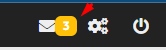
In the example above, I created a badge manually:
[[
hide:mobile-v |
ico:fas-envelope |
cls:align-label-left-center rc-hover-zoom-1-2 |
cls-caption:badge bg-warning |
append
]]
Describing the above attributes:
The icon will be hidden if accessed on mobile.
A fontawesome envelope icon will be displayed.
Some alignment and zoom CSS classes will be applied.
Some CSS classes will be applied only to the caption to create the badge.
With the "badge:" attribute:
[[
hide:mobile-v |
ico:fas-envelope |
badge:3 color:warning
]]
the "color:" parameter follows the bootstrap standard:
warning
info
danger
success
It is possible to manipulate the badge value:
rc_BadgeGetValue
rc_BadgeSetValue
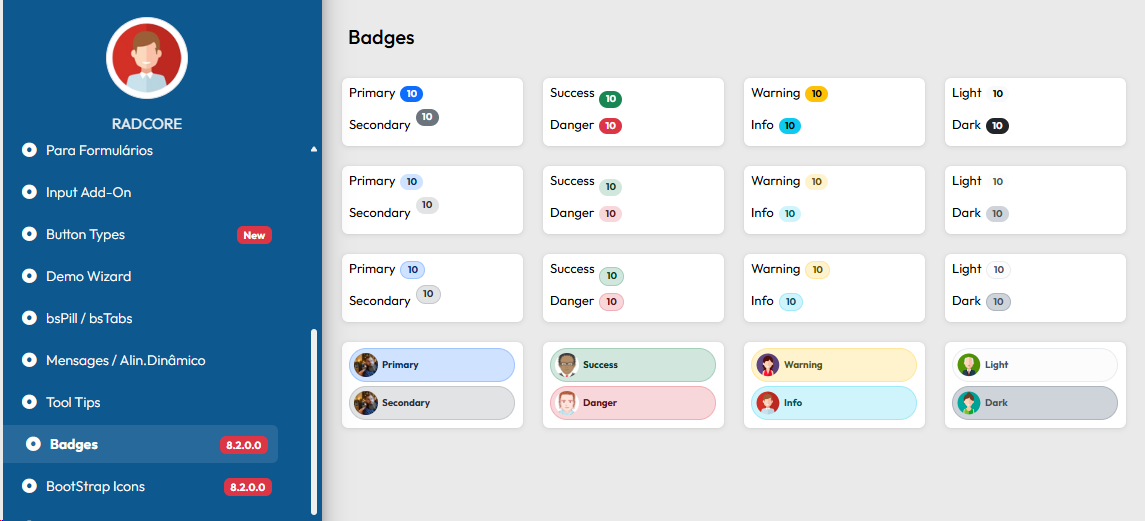
From version 8.2.0.0 you can see frmDEMO_BADGES with more layout options in bootstrap pattern
Created with the Personal Edition of HelpNDoc: Create cross-platform Qt Help files