Collapse and Accordion
It is possible and very easy to apply visuals that are normally done with pure html.
Collapse
See the explanation in this topic. Search for "collapsify"
Ex: collapse:rcBlock50 off-64 icons:fas-plus fas-minus
rcBlock50 is the block that will expand/collapse
off-64 indicates that when closed, 64 pixels of the block "rcBlock50" will be visible.
icons: sets the icons to open and closed. If not informed, the RC assumes the default icon.
icons-color: defines a class to apply a color to the icon
icons:off disables the display of icons and allows any object to be used for closing/opening.
collapsed: starts closed.
collapsed:mobile starts closed only if on mobile
Accordion
Once you have available a set of "containers" with "collapse" the procedure to apply the accordion is as follows:
Each "UniLABEL" of all "containers" that contain the "collapse:" attribute must have the same naming and a sequential.
Note: For now it is not possible to use "collapse" together with "scale:"
You can see 3 examples:
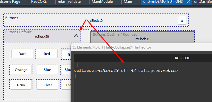
- frmDEMO_BUTTONS:

In this example, only when accessed by mobile, the block will be initially displayed, closed.
Note: It is important to remember that the use of collapse must be used with blocks of 12 columns. Visual Effect is not interesting with smaller blocks when closed.
- frmCadFERIADOS

- frmCadUSUARIOS:This dynamically creates

Created with the Personal Edition of HelpNDoc: Full-featured multi-format Help generator