The Basics
In the MEGA DEMO, frmDEMO_BUTTONS you will have several examples.
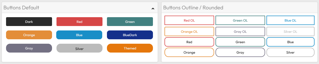
We will use CSS to define the layout of the buttons.
As previously mentioned, RadCORE already comes with several CSS classes that you can use directly in your projects.

btn.hint := 'cls:ButtonRed';
btn.hint := 'cls:ButtonOutline ButtonOutlineRed btn-font-red';
You can change the CSS of a button dynamically:
rc_ChangeCls( self, btn, 'ButtonOutlineRed', 'ButtonOutlineGreen' , true );
Preventing default rendering
You can "disable" the default theme control configuration and allow the colors you define to be used, just use:
[[theme-color:off]]
"btn:" Attribute
Starting with version 8.3.0.0, the "btn:" attribute was introduced to reduce the explicit use of CSS classes that make up the button.
Let's look at the same examples above, replacing the "cls:" attribute with "btn:":

btn.hint := 'btn:red';

btn.hint := 'btn:red outline';
Let's understand the syntax:
btn:red outline rounded
After the color attribute, this color continues to follow the standard CSS classes that come with RadCORE.
See the standard CSS file: Ex: "ButtonRed", "ButtonOutlinePurple".
The "outline" parameter sets the inner color to white and the edges to the defined color.
Next is the roundness parameter: round, rounded, roundest.
Created with the Personal Edition of HelpNDoc: Produce electronic books easily