Resizing Objects
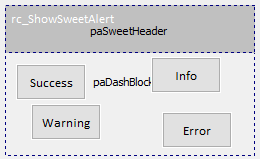
Let's look at some objects in the "frmDEMO_MESSAGES" example:
Use the HINT property to tell RADCORE how it should be rendered.
Resizing adjusts its width according to the PARENT OBJECT( PARENT ). Let's study the example above.
We linked 4 objects to simultaneously resize and align:
success button:
I want RadCORE to resize the success button by referencing rcBlock124( scale:parent ), extending its WIDTH to 45% of its referenced object's WIDTH ( rcBlock124 )( w:45% ) and adjusting its LEFT 5% of the LEFT of rcBlock124.
[[
cls:ButtonOutline ButtonOutlineGreen |
scale:parent w:45% |
pos-l:5%
]]
info button:
I want RadCORE to resize the info button by referencing rcBlock124( scale:parent ), enlarging its WIDTH with 45% of the WIDTH of its referenced object( rcBlock124 )( w:45% ) and aligning its position according to the sucess button( align:btnSweetSuccess) to the top( t:0 ) and to the right with an advance of 5px ( r:5 ).
[[
cls:ButtonOutline ButtonOutlineBlue |
align:btnSweetSuccess t:0 r:5 |
scale:parent w:45%
]]
warning button:
I want RadCORE to resize the warning button by referencing rcBlock124( scale:parent ), extending its WIDTH to 45% of the WIDTH of its referenced object( rcBlock124 )( w:45% ) and aligning its position according to the success button( align:btnSweetSuccess) to the top with an advance of the HEIGTH of the success button ( t:h+5 ) and to the left ( l:0 ).
[[
cls:ButtonOutline ButtonOutlineBlue |
align:btnSweetSuccess t:h+5 l:0 |
scale:parent w:45%
]]
error button:
I want RadCORE to resize the error button by referencing rcBlock124( scale:parent ), enlarging its WIDTH with 45% of the WIDTH of your referenced object( rcBlock124 )( w:45% ) and aligning its position according to the warning button( align:btnSweetWarning) to the top ( t:0 ) and to the right with an advance of 5px ( r:5 ).
[[
cls:ButtonOutline ButtonOutlineRed |
align:btnSweetWarning t:0 r:5 |
scale:parent w:45%
]]
rcBlock2:
This block will be hidden when in vertical mobile mode ( PORTRAIT ) "hide:mobile-v" rearranging the lower blocks and when active, its HEIGHT should be scaled according to its PARENT object "scale:parent h:100%-top" , we still apply the removal of all borders of OFFSET( or GUTER ) "noborder-all" so that the IMAGE is filled in the object's borders.
Let's see its attributes
[[
cols:xs-12 sm-12 md-6 |
hide:mobile-v |
noborder-all |
scale:parent h:100%-top
]]
rcBlock460 object in frmRCBLOCKS
It is also possible to give an "offset" to the "scale:" attribute.
Let's look at the contents of the block:
[[
cols:xs-12 sm-12 md-6 |
scale:parent h:100%-top off:15 |
round:no |
cls:card-info-box-white
]]
As we can see, the "off:15" parameter was added, where 15 is the number of pixels that must be discarded by the result of the "h:" parameter. This causes "rcBlock460" to stretch to the bottom of its "parent" minus 15 pixels which would be the normal offset value ( gutter ) between responsive blocks.
It is possible to use the "default-offset" parameter instead of the nominal value when the reference is exactly the offset ( gutter ) between the responsive blocks.
Ex: scale:parent h:100%-top off:default-offset |
It is also possible to reference an object in "off:" and still add an explicit value. Imagine that you want to expand a block/component, but at the base of your "parent" there is another component. So the "offset" would be the "height" of that component and/or a few more pixels.
In some situations it may be necessary to apply the "scale:" only in DESKTOP, for that, to "turn off" when in mobile use:
scale:parent h:100%-top off:15 mobile-off
Note:
"scale:" was not created to be used in responsive blocks although it is possible to apply the example above in a block, for example, containing a grid but that will only be better rendered if this block is the last one in the list.
For a better experience with vertical scaling in responsive blocks, use the "hr:" in the "Responsiveness - Resizing blocks" topic.
This shows how we can exploit diverse features of radcore and easily expand those functionality.
Created with the Personal Edition of HelpNDoc: Easily create Qt Help files