rcBlocks
8.5.0.1
The MAINFORM is inside a uniScrollBox( sboxGridBlock ).
Note 1:
When creating your forms, you must insert a uniScrollBox to receive your responsive blocks.
While uniContainerPanel (with autoscroll = true ) also works, it has been observed that in some circumstances it doesn't deliver optimal results.
Note 2:
By default, RadCORE will "block" the horizontal scroll of all "TUniScrollBoxes," maintaining only the vertical scroll.
If you want to display the horizontal scroll bar, simply use the attribute:
[[scrollbar:show-h]] como é demonstrado no "frmDEMO_PANELS"
Note 3:
By default, RadCORE will remove the "alClient" from all "TUniScrollBox" objects and apply anchoring to avoid rendering issues.
If you want to keep the "alClient" attribute, simply use the following attribute:
[[scrollbox:reset-off]]
Blocks are responsible for applying "responsiveness" to our screens.
I tried to use a syntax similar to BootStrap's; let's understand:
As explained in the previous topic, RadCORE creates a 12-column grid, with each column having 20px of space between blocks (offset or gutter).
The gutter/offset will always be unique (in the theme control, you can increase or decrease the default value).
A row of blocks should be formed by adding its columns together to a total of 12 (you'll see later that this value can be customized).
Let's look at the following configuration:
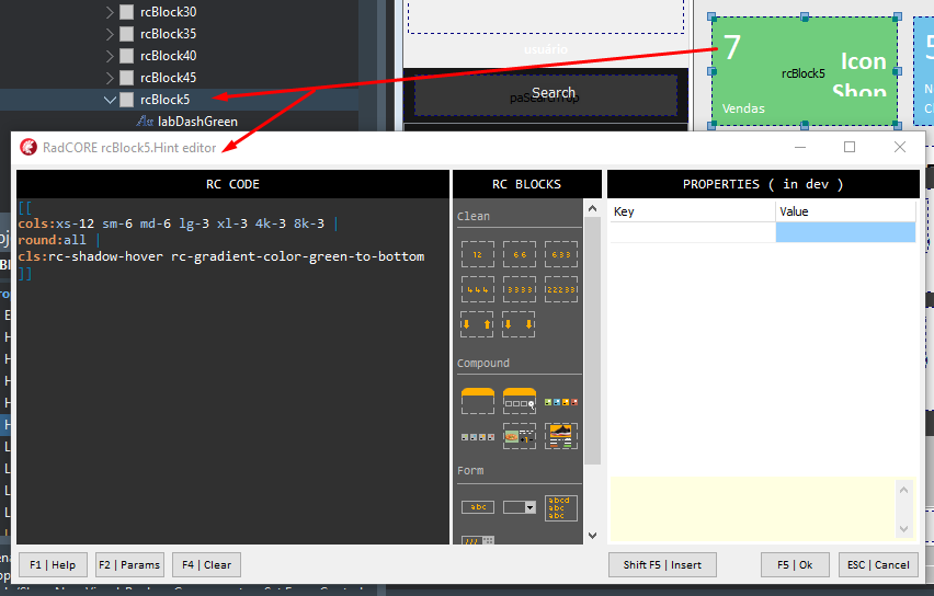
[[cols:xs-12 sm-12 md-6 lg-3 xl-3 4k-3 8k-3]]
// default values
XS Extra Small: Very small screens
SM Small: Small screens
MD Middle: Medium screens
LG Large: Large screens
XL Extra Large: Extra large screens
4K Screens
8K Screens
On small screens (XS and SM), I tell RadCORE that this block will span 12 columns, meaning there will be only 1 block per row.
On medium screens (MD), I tell RadCORE that this block will span 6 columns.
On large screens (LG, XL, 4k, and 8k), I tell RadCORE that this block will span 3 columns.
IMPORTANT: Always start the attributes of a block with "cols:"
Tip:
From "md-" onwards, RadCORE assumes the same configuration for subsequent items:
[[cols:xs-12 sm-12 md-3]]
That is, lg- xl- 4k and 8k will receive 3 columns as well.
By only informing the number of columns, the value is applied to all variations:
[[cols:12]]
LEARN MORE:
As you can see, responsive blocks have their own organization system, even if you leave them disorganized on the screen, meaning you don't need to worry about the VCL (WYSIWYG) standard.
By default, responsive blocks regroup with a smooth motion animation and a fade.
In addition to turning this off globally in the theme control, you can do it for specific blocks by using the following attributes:
- animate:off
- fade:off
For a better understanding, run tests and try changing the values.
WARNINGS
> Do not use left-hand ZEROS ( 001 , 010 ).
Use:
rcBlock5 , rcBlock6 , rcBlock7
rcBlock10, rcBlock20 , rcBlock30
rcBlock50, rcBlock100 , rcBlock200
rcBlock10, rcBlock300 , rcBlock310
> Use intervals of at least 10 in 10 between one block and another. It cannot exceed 1000.
Ex: rcBlock10, rcBlock20, rcBlock30
> The limit per screen is 5000 blocks (limit imposed by me, but there are no real limits)
> Do not use anchoring or alignments in blocks ( alTop, alClient... ).
Responsive Blocks have their own organization system.
Note: When building your application screens, try not to mix components ( panels ) with the Align( alTop, alClient... ) property together with responsive blocks. In some situations (especially with FORMS) some anomalies occur. Always try to use responsive blocks and, WITHIN THE BLOCKS, if necessary, place the component with the alignment you need, don't use, for example: an alTop panel and below it a responsive block.
This makes it easier for us not to depend on the "TAB ORDER" and for us to have a "space" to, if necessary, insert blocks among others previously created.
Blocks will help apply "responsiveness" to our screens.
In the HINT property of each block you will specify how it should behave in each 'device'.
I tried using a BootStrap-like syntax, let's understand:
As explained in the previous topic, RadCORE creates a GRID of 12 COLUMNS and each column with an initial width of 150px + 15px ( offset or Guter ).
Guter/offset will always be unique (in the theme control you can increase or decrease the default value).
A row of blocks must be formed by adding their columns up to a total of 12. In the example above, the first 4 blocks have the same configuration:
[[cols:xs-12 sm-6 md-6 lg-3 xl-3 4k-3 8k-3]]
// default values
XS Extra small: Telas muito pequenas
SM Small: Telas pequenas
MD Middle: Telas médias
LG Large: Telas grandes
XL Extra Large: Telas Extra Grandes
4K Telas 4K
8K Telas 8K
On small screens ( XS and SM ), I tell RadCORE that this block will occupy 12 columns, that is, there will be only 1 block per line.
In medium screens ( MD ), I tell RadCORE that this block will occupy 6 columns, that is, it will be only 2 blocks per line.
On large screens (LG, XL, 4k and 8k), I tell RadCORE that this block will occupy 3 columns, that is, it will be only 4 blocks per line.
From "md-", RadCORE assumes the same configuration for the subsequent items:
[[cols:xs-12 sm-12 md-3]]
That is, lg-xl- 4k and 8k will receive 3 columns as well.
Informing only the number of columns, the value is applied to all variations:
[[cols:12]]
LEARN MORE:
As you can see, responsive blocks have their own organization system, even if you leave them disorganized on the screen, that is, you don't need to worry about the VCL (WYSIWYG) standard.
IMPORTANT:
In a "line of blocks" all must have the same "height" or the same height. At the time of the "line break", the next block will assume the "top" + "height" + "default offset" position of the previous block.
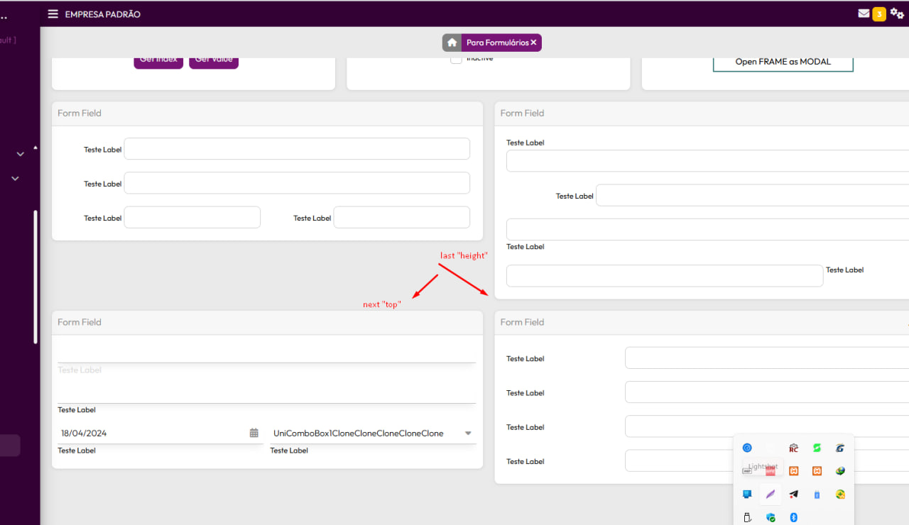
If any block on the "same line" has a dynamic height (as in the example, "hr-childs:" is being used), it is possible to replicate its height to the other blocks.
You will see more about "hr-childs:" and how to do this later.
IMPORTANT: Always start a block's attributes with "cols:"
From version 7 onwards, 3 new attributes were added to guide and give more freedom when creating blocks.
By default, responsive blocks when regrouping do so with smooth motion animation and a fade.
In addition to turning it off globally in the themes control, you can do it in specific blocks, just use the attributes:
- animate: off
- fade:off
For a better understanding, run tests and try changing the values.
Created with the Personal Edition of HelpNDoc: Easy EPub and documentation editor